Today I made some progress on my 3D project, I made a small prototype using plastic from my easter egg box and black marker. Initially, I wanted to make this using colour because I want my final outcome to be in colour, but the materials I had didn’t really work as planned.
The first image is the marker, this worked really well and was easy to use because the tip was very fine – perfect for drawing the small letters. In terms of colour, I tried markers and the tip was too thick, as well as this, the colour was too translucent and patchy, making it hard to understand the letters. In a final attempt, I decided to try gauche paint, however this was also unsuccessful as the different colours have contrasting formulas, yellow and blue were very opaque but to achieve the same level using pink I had to layer a lot of paint. To be able to read the letters I had to go in with my scalpel knife and lightly scrape away the paint I didn’t want.
It was very interesting to see how my image would work in the real world, viewed out of a computer screen by the human eye. This would help me conclude if the method I was using to create the image would really work or not.
It did work! As I had imagined, the text would be a little bit too big to be able to see all the details of the face, however, the further you stand from the layers, the easier it is to make out the face. I was really glad that it worked decently in the small scale because this meant that it would work very well in the larger scale, malden with more precision and with finer letters for finer details.
As I didn’t go in the walking trip on Tuesday because of the rain, I had to go yesterday to take some images for the workshop today. This workshop helped us consider type as a shape, using stencils meant that we would be playing with the different edges, angles and orientations of letters to create an image.
The final outcome for this project has to be 3D so making a 2D image was useful but I also wish we had more time and were given the chance to try 3D. We did 3D sketching before but it was in such an early stage of the project that it didn’t really serve a purpose for the final outcome, it was just an initial exploration of 3D.
I did enjoy working in groups, especially because we all benefit from using each other’s tools and ideas to create this image. We used a lot of different materials and colours but the final result is quite balanced and there’s an obvious colour coordenativos between each of the members of the group. This project did make me consider using text to make an image rather than altering text to create and image. In other words, as a lot of people would be taking the path of distorting text and playing with shapes to create their image, I thought I could use unaltered text to create an image through layering.
I really enjoyed this exhibition because I very interested in seeing how other students created their storyboards with the limitation we had. It was amazing to see the variety of outcomes and the way that people worked around the colour limitations. I saw some people take on the same technique I did, mixing primary colours to achieve more tones.
As well as this, we had to work together to curate the space. All the storyboards where divided by song but it was important to consider the order and positioning on the wall depending on the colours and materials. This is important because the exhibition needed to be balanced and functional, things couldn’t be placed too high because it wouldn’t allow the audience to view the details in the small panels. Similar colours were aligned in the same row, with contrasting work in the rows above or below.
The term “Craftivism” was popularised by writer Betsy Greer through the publication of her book “Craftivism: The Art and Craft of Activism”, which I will be referencing hereafter. Greer bought the domain craftivism.com in March 2003, creating a platform where she could talk about the concept, that was “no longer just a crazy idea in [her] head” (Greer, 2014, p.12). The Craftivist movement can be considered a result of third-wave feminism. Lead by the Generation X, it is predominantly anti-capitalist and eco-driven. “Each generation has its radical crafters” writes Ele Carpenter (2010), curator and writer in politicised art. Carpenter references two exceptional examples of Craftivist Art like the Aids Memorial Quilt (1987) and Marianna Jørgensen’s Pink Tank (2006). In both cases, the craft is collaborative and about inclusion and community.
Princess Diana Shakes the hand of an identified patient, at the Middlesex Hospital Broderip Ward, unit of care for people with HIV infection [Video] ITV News, 2017, footage from 1987. Accessed 11 May 2019, from https://www.youtube.com/watch?v=XU0SPrCTwsY.Aids was first identified as a disease in 1981, in early stages of research, it had already been concluded that the virus was transmitted sexually as well as via contaminated blood (Flemming, 2000, p. 1037). However, many chose to ignore these facts, believing that HIV could be passed on through kissing or simply touching the infected. In 1987, Princess Diana joined the inauguration of the Middlesex Hospital Broderip Ward for the HIV infected, the first Aids Ward in London. During her visit, she shook hands with the patients and staff, one member in particular showed his admiration for the Princess’s choice to not wear gloves. Being HIV positive himself, he believed this truly helped raise awareness to the misconceptions about HIV/Aids (ITV News, 2017, footage from 1987).
This same year, on the other side of the world in San Francisco, possibly the “largest piece of community-crafted folk art in the world” was being created (Fader, 2012). The Aids Memorial Quilt honours those who live with and have died from Aids, that continues to spread dramatically, with an estimate of 37 million infected in 2017 (Unaids, 2018). Creating a piece of community artwork like this quilt, amounting over 14 million visitors since 1987 and with over 48,000 panel contributions (Aidsquilt, 2019), challenges the exclusion and alienation that those living with the disease feel. In its premature phase, Craftivism was simply craft, an art form that was considered inferior to sculpting and painting. In accordance to this, craft was almost exclusively unpaid work of a woman, belittled and always undervalued compared to the work produced by a man.
Pink M.24 Chaffee Tank [Photograph] Tony Lack, Copyright permission granted by Marianne Jorgenson. Retrieved 11 May 2019, from https://www.researchgate.net/figure/Pink-M24-Chaffee-Tank-Copyright-permission-granted-by-Marianne-Jorgenson_fig1_324907301If we observe Marianna Jørgensen’s Pink Tank, a response to the UK, US and Denmark taking action in the Iraq War of 2006 (Myzelev, 2015, p. 68), we see the bold use of the colour pink. This colour remains a symbol of femininity but it no longer holds connotations of weakness and vulnerability like it did in the past. Nonetheless, the use of soft pink yarn wrapped around the colossal war tank is undeniably contrasting, thus being the irony behind yarn-bombing. What was dismissed for being an inferior practice, made by women in the comfort of their home, was now exhibited in a monumental scale, where everyone could see it. However, craftivist art exists also in a smaller scale, Greer writes: “I had always thought that activism had to be loud and in-your-face (…) it made me think about quiet activism and wonder how craft could be a part of it.” (2014, p. 11). In the Craftivist Collective Guide to Craftivism, the author explains how she separated herself from anarchist, violent Craftivism and took on cross-stitching. Displaying mini protest banners around public spaces in a provocative but unthreatening way (Corbett and Housley, 2011, p. 345). To conclude, I would like to end with Greers comment on craft as activism, since I believe it summarises the purpose of the art form: “the creation of things by hand leads to a better understanding of democracy, because it reminds us that we have power.” (2014, p. 12).
Fader, Lainna (2012) Microsoft Creates Online Version of the Massive Aids Memorial Quilt, Wired Magazine. Accessed 11 May 2019, from https://www.wired.com/2012/07/microsofts-online-version-of-massive-aids-memorial-quilt/
At my final critique I presented a series of tests that I had made for my project. I haven’t yet started to draw on the Screenprinted final page because I was stuck between two ideas that I had and also the materials I was going to use. My initial character and idea was for the song “Monkey Gone to Heaven”, but there was another song that I was also very interested in, “Vicious” by Lou Reed.
At the critique I showed some sketches of both in different colour schemes and using different materials. I first tested the colours in rough sketches. I tried a version just in Ball point pen and pencil and I really liked the colours but if I had chosen to go with Black, Blue and Pink (making purple out of the combination of the last two) I wouldn’t have much contrast and the images would look a little bit dull. I tried pen also, but instantly thought it was a bad idea because it would look very streaky if I had to colour 9 panels.
I tried using primary colours and black, which is over the colour limit but I wanted to see what i would look like because I could make a dark colour using a combination of all. My first attempt was on normal printer paper, so it didn’t really look great – in the test before I had achieved some really nice textures that I didn’t get this time. I tried again with the 4 colours and used a different shade of blue which I think made the image have more depth and also contrasted more with the strong red. Nonetheless, I was using 4 colours and I would be really hard to layer the 3 primary colours for a thin outline, it would end up looking messy. Because of this, I decided to get rid of the black outline and use only the primary colours.
As for vicious, I tried a large variety of different combinations using pen, coloured pencil, market, oil pastel. Since my tutor did show preference for the “Monkey Gone to Heaven” idea, I decided to go with that one. As well as this, that was also the idea that I had began development of my character from so it made more sense in terms of progress to continue with the original idea.
Humour is a social act, a human character trait and a ubiquitous human practice (Tapley, 2006, p. 421). In this entry, I will be analysing Giselinde Kuipers decoding of the requisites of effective humour and how they work (2009).
According to Kuipers, there are no necessary and sufficient conditions for Humour but a notion of ingredients that determine its proficiency and enjoyment (2009, p. 220). The first mentioned is incongruity, that can be identified in perhaps the 1936 comedy “Modern Times”, created by Charlie Chaplin. The main character, played by Chaplin, wears oversized shoes and pants resembling a clown costume which completely deflects from the sombre factory scenes with dangerous machinery. Incongruity works because it is unexpected, the combination of the two elements mentioned previously create an ironic contrast between seriousness and playfulness.
The second ingredient is non-seriousness, in this case, scenes “framed” to premeditate or indicate the joke. This “set-up” allows the viewer to enter a playful state of mind, where it is understood that all being said is for the sake of humour and entertainment, allowing people to be “rude, offensive, or vulgar in ways that would not be allowed in serious interaction” (Kuipers, 2009, p. 221). In “Modern Times”, there are countless scenes where, realistically, the characters would be enduring unbearable physical pain. However, these scenes are considered funny because the audience knows that it is not true, they’re not actually being crushed between machine gears as seen in the trailer (Charlie Chaplin Official Youtube, 2010).
The third ingredient is pleasure, which is directly linked to sociability. Humour is a social act that allows people to establish a more proximate and relaxed relationship. Laughing at a joke is an expression of approval and validation to the joke-teller. As for the audience, it has been scientifically proven that laughter generates the release of positive neurotransmitters in the brain like dopamine, serotonin and other endorphins (The Harvard Mahoney Neuroscience Institute, 2010, p. 1). These chemicals are known to make use feel a natural high.
The final ingredients of humour are described by Kuipers as the most confusing and controversial, one being transgression and the final, superiority, which implies simultaneous degradation (2009, p. 222). It’s a fact that humour has been used to criticise injustice and societal vices, this can also be seen in Chaplin’s movie. Chaplin used humour to expose the consequences of modern industrialisation and the struggle of those living during the Great Depression. This is the foremost advantage of humour, it allows us to enlighten the audience in an appealing, subtle and lighthearted way.
Withal, according to Jean Harvey, this can also be used negatively. The position of the joke-teller is a position of superiority over the audience and the subject of the joke. In many cases, the joke is told by the someone in a privileged position, reaffirming their power over minorities and receiving the undoubted approval of the bystanders (Harvey, 1995, p. 19-20). Personally, I cannot deny that humour can be repressive, especially to those who find themselves as the ”butt of a joke”. Nonetheless, I don’t believe that all instances of humour are wicked and immoral because they also allow the disadvantaged to shed light on their reality, as Chaplin does so cleverly.
Harvey, Jean (1995) Humor as social act: Ethical issues; The Journal of Value Inquiry Vol, Iss.19-30 Kluwer Academic Publishers. Printed in the Netherlands. Available at: https://link.springer.com/article/10.1007%2FBF01079060?LI=true [Accessed 20 April 2019]
In this workshop we were asked to begin working on our final outcome for the project. The final piece would be done on an A2 9 panel Screenprinted page, which we only got 1 copy of. This meant that we had to be very careful with it and also pay attention to the rules given to us. We couldn’t use any wet materials (excluding screenprint) and could only use 3 colours excluding Black and White. This made the project a lot more challenging but also more realistic. We still had sometime to focus on the project so I didn’t really create anything that day, I just thought about the colours I wanted to use and the style I was going to give to my character.
I follow a page on instagram called @colorpalette.cinema that posts movie scenes with the colour palette under the image. It is very interesting to see how these palettes change depending on the genre and director – but also how the same movie can incorporate such a wide variety of different colours whilst still keeping a consistent aesthetic and balanced cinematography.
The two screencaps above are from director Sofia Coppola’s “Marie Antoinette”, both scenes have a lot of light and use warm colours like beige, pink, brown and yellow-toned greys.
These three screencaps are from”The Place Beyond the Pines”. In the first two scenes, there’s the use of strong light and colour, contrasting with the dark backgrounds. You can tell that these scenes are moments apart from the similarities of the colour, the teal and red. The last scene transmits a different emotion through the use of cold tones.
During this lesson we explored the relationship between colour a meaning. In the beginning of the lecture, it was important to establish the different classes of colour and different ways in which we perceive colour. According to the Encyclopaedic Dictionary of Media, Entertainment and Other Audiovisual Terms, primary colours are “the three basic colours allowing the creation of all other colours through the process of mixing”. Secondary colours are the colours formed through the combination of two primary colours, tertiary colours of a primary and secondary colour.
Twelve-part colour circle, developed from the primary colours yellow/red/blue and the secondary colours orange/green/violet, Johannes Itten, The Elements of Colour (1961).
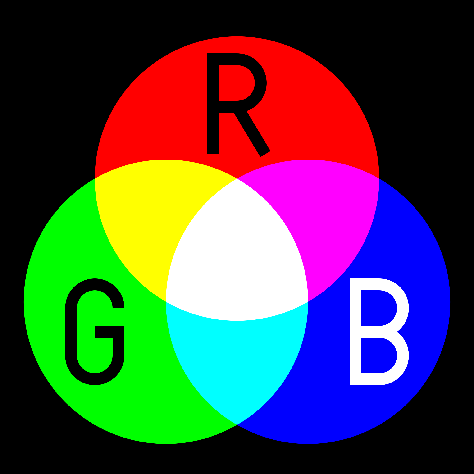
“The additive primary colours of light are red, green, and blue (technically, more of a blue-violet but most people just call it blue). This is typically abbreviated RGB. When an additive primary colour mixes with its complement, it produces white. Most children are taught that the subtractive primary colours (paints, pigments, and dyes) are blue, red, and yellow when in fact they are cyan, magenta, and yellow. This is typically abbreviated CMY. Printing presses often add in black, or CMYK.”
additive coloursubtractive colour
The colours we see in a screen are RGB colours, “each pixel on the screen is built by driving three small and very close but still separated RGB light sources. At common viewing distance, the separate sources are indistinguishable, which tricks the eye to see a given solid colour. All the pixels together arranged in the rectangular screen surface conforms the colour image.” (Wikipedia, 2019). To create a wide variety of colours, these light channels are altered in levels of intensity. If in full intensity, the human eye perceives white, when they have no intensity, there is absence of light, therefor we see the darkest colour – black.
In the image above, you can see lines formed by the alignment of the different colour pixels. Below, you can distinctively see different intensities of red, green and blue that from afar are perceived as skin colour, these the lower levels of light are areas of shadow (the eyelid) and the full intensity is perceived as white (the sclera of the eye).
Colour and Meaning
After discussing theory of colour, we considered the universal connotations behind different colours. The colour red, for example, is chosen for many brand logos specifically because it is associated with passion, heat, lust. In contrast, green is chosen for is connotations to growth, health, environment and luck.
McDonalds uses a warm yellow and red because, as a fast food company, they want customers to know that their food is hot. Netflix is an online streaming platform. The most popular genres include romance and action – which are filled with passion and danger, these intense feelings are associated with the colour red.Whole Foods is an organic food market that exclusively sells products free from artificial colours, flavours, preservatives, sweeteners and hydrogenated fats. The colour green reflects the freshness of their products. Land Rover is a car brand most well known for their 4×4 and SUV models, designed for all-terrain driving. By using the colour green, they transmit the idea of universality in their ability to drive anywhere.
I was excited for this workshop because I really like character design and wanted to learn more about this. However, the previous workshop we had was not very conclusive for me, I liked that we were interpreting our fears but my final outcome wasn’t great for this progress as it was a collage.
We were asked to rescale our image from the previous workshop and use this to develop a character, exploring the various angles and positions of our “monster”. In my case, I drew inspiration from my collage to create a new character. Initially when drawing, I was just trying to draw a creepy man with some clown elements.
However, I was inspired by two-face from Batman to make one side of the face look like it was melting off from exposure to toxic substances – because I wanted my character to be in space. After colouring in the melting side of the face with pink to make it look like burnt flesh, it reminded me of a strawberry.
I thought it would be cool to have this character have a strawberry head especially if I added a helmet. It gave the character an interesting contrast between serious and funny, scary and sweet. I redrew my character in different outfits and stylised my initial drawing: wider head, larger eyes, less intense shading. Overall, the character was transformed into a less creepy version of the first improvised drawing.
When introducing the character into the 6 box narrative, I knew there where some key moments I wanted to include. I had already decided on the song “Monkey Gone to Heaven” by the Pixies because it was a song I was familiar with and I thought I could easily tie to the fears I had reflected on. In the song, they talk about a “creature in the sky” being “sucked by a hole”, I wasn’t quite sure if I wanted my character to be the creature or if I wanted an new element to have that role. I did know that I wanted to set it in the middle of space, and this lyric allowed me to do so.
Some of the key elements I wanted were:
– a shot of the character running;
– a toxic substance, fire or other;
– a final close-up shot of the character on the floor, accepting his demise (for the lyric “this monkeys gone to heaven”).
I experimented with my character style when I got home using Photoshop.


 As for vicious, I tried a large variety of different combinations using pen, coloured pencil, market, oil pastel. Since my tutor did show preference for the “Monkey Gone to Heaven” idea, I decided to go with that one. As well as this, that was also the idea that I had began development of my character from so it made more sense in terms of progress to continue with the original idea.